


Project Overview
The purpose of this project is to revamp the Arka Learn website, enhancing its user interface (UI) and user experience (UX) design to create a more engaging and intuitive platform for learners. As the UI/UX designer, my role is to improve the visual appeal, usability and overall functionality of the website, ensuring it aligns with Arka Learn goals and target audience.
Timeline: Jan - Jul 2022 (Internship) | Jan 2023 (Freelance)
Role: Lead of UI/UX Designer
Team: Andy - Developer | Sinta - Graphic Designer
What they Said?
it is great working with you Reyhan. you can demonstrate your ability in UI/UX, team work, manage to meet deadline and one thing that i love the most is fast response!! - Henny Wahyuni // Founder & CEO of Arka Learn
Reyhan is an exceptional UI/UX designer. Their attention to detail, creativity, and passion for their work are truly impressive. They consistently deliver visually stunning and user-friendly designs, and their positive attitude makes them a pleasure to work with. I highly recommend Reyhan for any design project. - Eko Yuni Mulyanto // Founder & COO Arka Learn
In four months, my team and I successfully revamped the website, enhancing its design, functionality, and user experience.
Together, we implemented strategic improvements, resulting in increased user engagement, higher conversion rates, and overall positive feedback from visitors.
Sales growth
Through meticulous attention to user experience, intuitive interface design, and strategic visual enhancements, I optimized the customer journey, resulting in heightened engagement and increased conversions.
New User
Through my strategic user acquisition campaigns and targeted marketing initiatives, I achieved an impressive threefold increase in the company's user base, taking it from 2000 to an astounding 6000+ and still growing now.
Partners
We have expanded our partnerships by adding 4 new companies, bringing the total from 6 to 10, thanks to our new design.
Satisfaction
Based on the data gathered from all the students studying at Arka and our Arka partners, it is evident that everyone is completely satisfied with the new design.
01
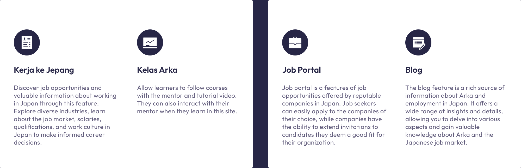
Introduction.
Working on the landing page & dashboard gave me good knowledge to understand the target and the audience that was using the product. The challenge was to design a product used by managers and learners at the same time. The product is divided into two major parts:
02
Project Goals.
- Enhance Visual Appeal: Create a visually appealing and modern design that aligns with Arka Learn's brand identity while attracting and retaining users.
- Improve User Experience: Streamline the user journey, simplify navigation, and optimize the overall user experience to ensure seamless interaction and increased engagement.
- Increase User Engagement: Implement interactive elements, visually appealing graphics, and intuitive features that encourage users to actively participate and explore the platform's content.
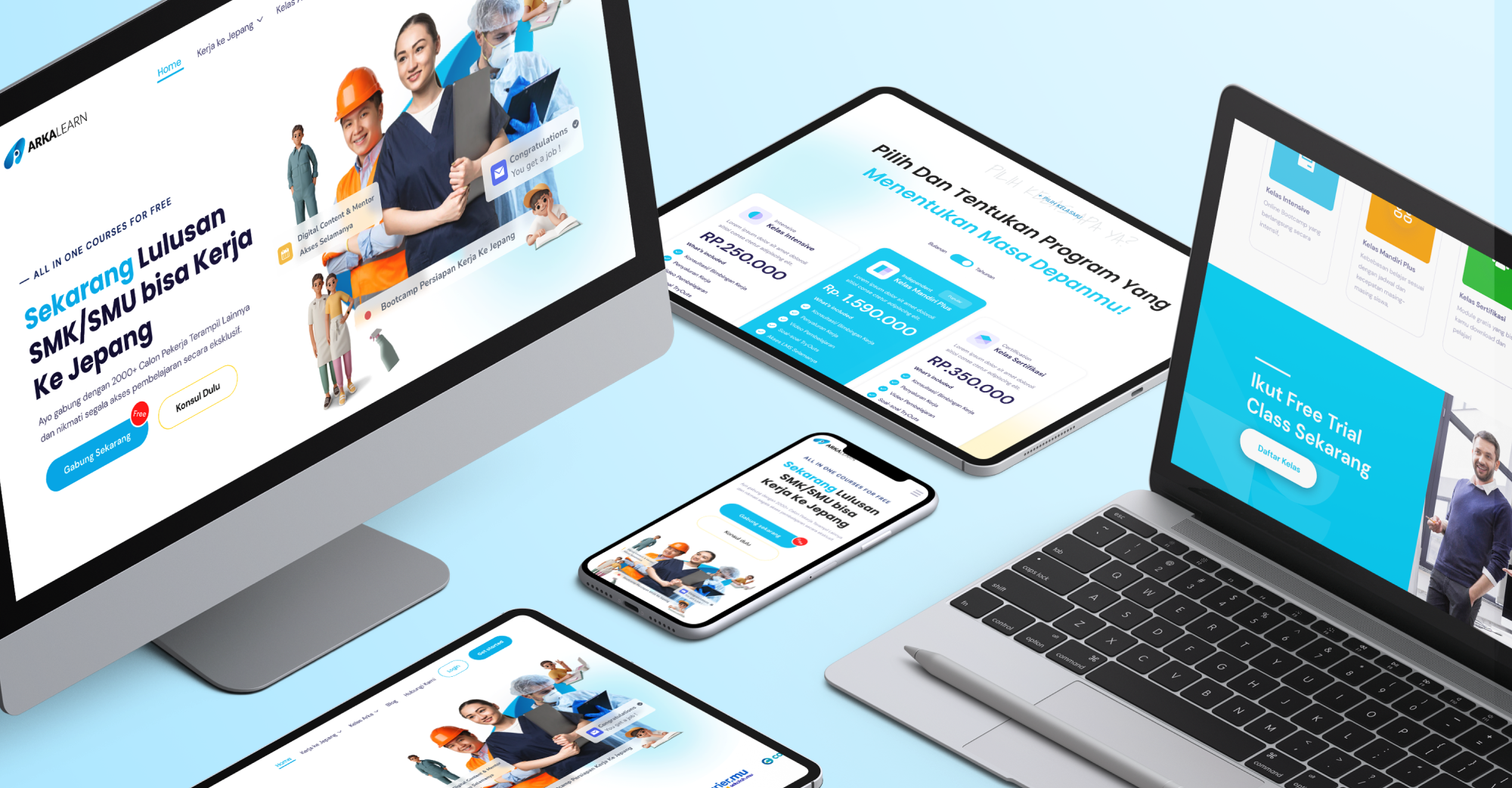
- Optimize Responsiveness: Design a responsive website that adapts seamlessly to different devices, ensuring an optimal user experience across desktop, mobile, and tablet platforms.
03
Problems That I Need to Solve.
Problem 1: Onboarding Optimization
The current onboarding process for ArkaLearn's education and job portal lacks clarity and intuitiveness, resulting in a high bounce rate. Design a user-friendly and streamlined onboarding experience that guides users through the essential steps, ensuring they understand the platform's value and ease of use. Create a fun yet professional onboarding experience that engages users with interactive elements and delightful animations, ensuring a positive and seamless introduction to ArkaLearn.
Problem 2: Job Search Relevance
Users find it challenging to discover relevant job listings that match their qualifications and preferences due to a cluttered and disorganized job search interface. Create a user-centric job search design that incorporates advanced filtering options, clear categorization, and a personalized recommendation system to enhance the job search experience.
Problem 3: Mobile Responsiveness and Accessibility
The current user interface of ArkaLearn does not fully adapt to mobile devices, resulting in a subpar user experience for mobile users. Improve the website's mobile responsiveness and ensure accessibility for users with disabilities, complying with accessibility guidelines to make the platform inclusive and user-friendly across various devices.
Problem 4: Streamlined Job Application Process
The job application process on ArkaLearn is lengthy and discourages users from completing applications. Redesign the application flow to reduce the number of steps and minimize friction, providing users with a seamless and efficient application experience.
Problem 5: Building User Trust and Security
User trust is essential for the success of ArkaLearn. Improve the user interface by incorporating trust-building elements, such as visual cues for security (e.g., SSL certificates), clear privacy policies, and user-friendly security features that protect users' data and information
04
Principal tasks.
The principal issue was for the learner to have a clear understanding of the structure of their course. Some elements were taking a lot of space, and the learner didn’t have a clear vision of what they were supposed to do.
My first step was to determine where the main pain points of the product were and what was achievable in the timeline we had. I started my work by doing a complete inventory of what were the elements and features of the studio. From basic action for a learner to the type of content inside a course (quiz, videos, etc.).
05
Research.
The purpose of this UX research is to evaluate the user experience (UX) of three prominent education and job portal websites in Indonesia: Glints, Ruang Guru, and Arka Learn. The study aims to identify strengths and weaknesses in their usability, functionality, and overall user satisfaction to make data-driven recommendations for improvements.
Methodology.
- Target Users: The research included students, job seekers, and professionals actively using education and job portal websites.
- Data Collection: A combination of qualitative and quantitative methods was employed, including 20 user interviews, 500 survey responses, and usability testing with 30 participants.
- Metrics: Participants were asked to rate their experiences on each website, including navigation, search functionality, content relevance, design aesthetics, mobile responsiveness, and overall satisfaction.
- Sample Websites: The comparison included Glints, Ruang Guru, and Arka Learn, representing education and job portal platforms.
Research Objectives.
- Evaluate the usability and user-friendliness of Glints, Ruang Guru, and Arka Learn.
- Identify common pain points and areas for improvement in the analyzed platforms.
- Compare Arka Learn's performance with Glints and Ruang Guru in terms of UX and features.
- Gather insights to enhance Arka Learn's UX based on best practices observed in other websites.
Research Phases.
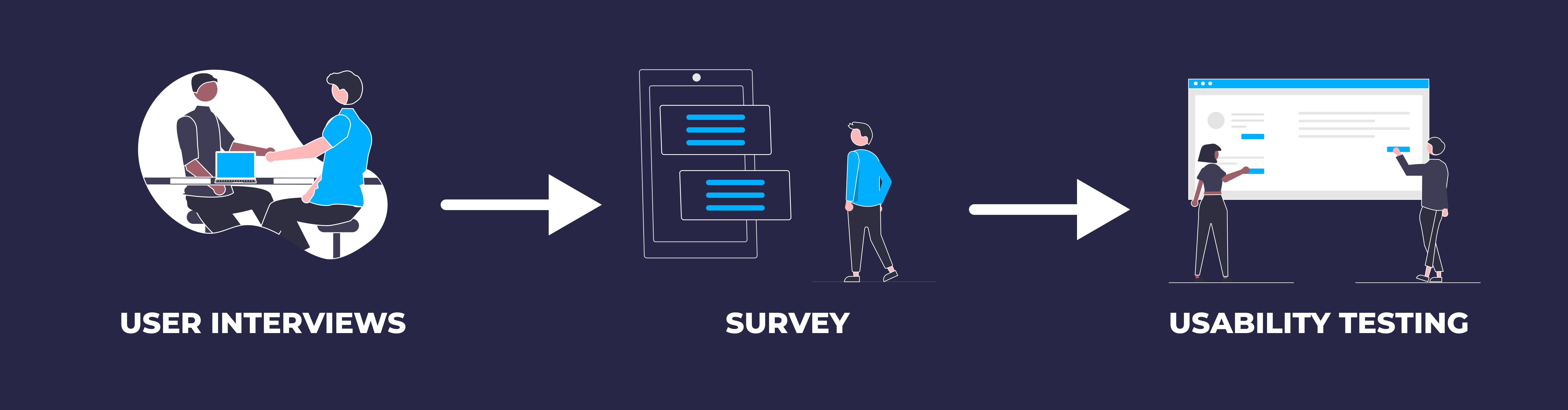
User Interviews.
- Glints: Participants praised Glints navigation, finding it intuitive and easy to discover relevant jobs.
- Ruang Guru: navigation received positive feedback, with users appreciating the straightforward access to job listings. However, some suggested improvements in the design of company profile pages.
- Arka Learn: navigation was well-structured, but users recommended making the search functionality more prominent.
Survey.
- Glints: Search functionality received positive ratings, with 88% of users finding relevant job postings quickly. Some users suggested additional filters for job preferences.
- Ruang Guru: search feature was highly rated, with 92% of users satisfied with the accuracy of educational resources. Some participants recommended an improved search algorithm for study materials.
- Arka Learn: Search functionality was well-received, with 90% of users finding courses and instructors easily. A few users suggested adding filters for price and course duration.
Usability Testing.
- Glints: Task completion rates for Glints were 80%, with users navigating through job listings smoothly. However, some users faced challenges while applying for jobs directly on the platform.
- Ruang Guru: Demonstrated a high task completion rate of 95%, with users easily accessing study materials and interactive lessons.
- Arka Learn: Achieved a task completion rate of 88%, with some users facing minor challenges while enrolling in specialization programs.
Evaluation Criteria.
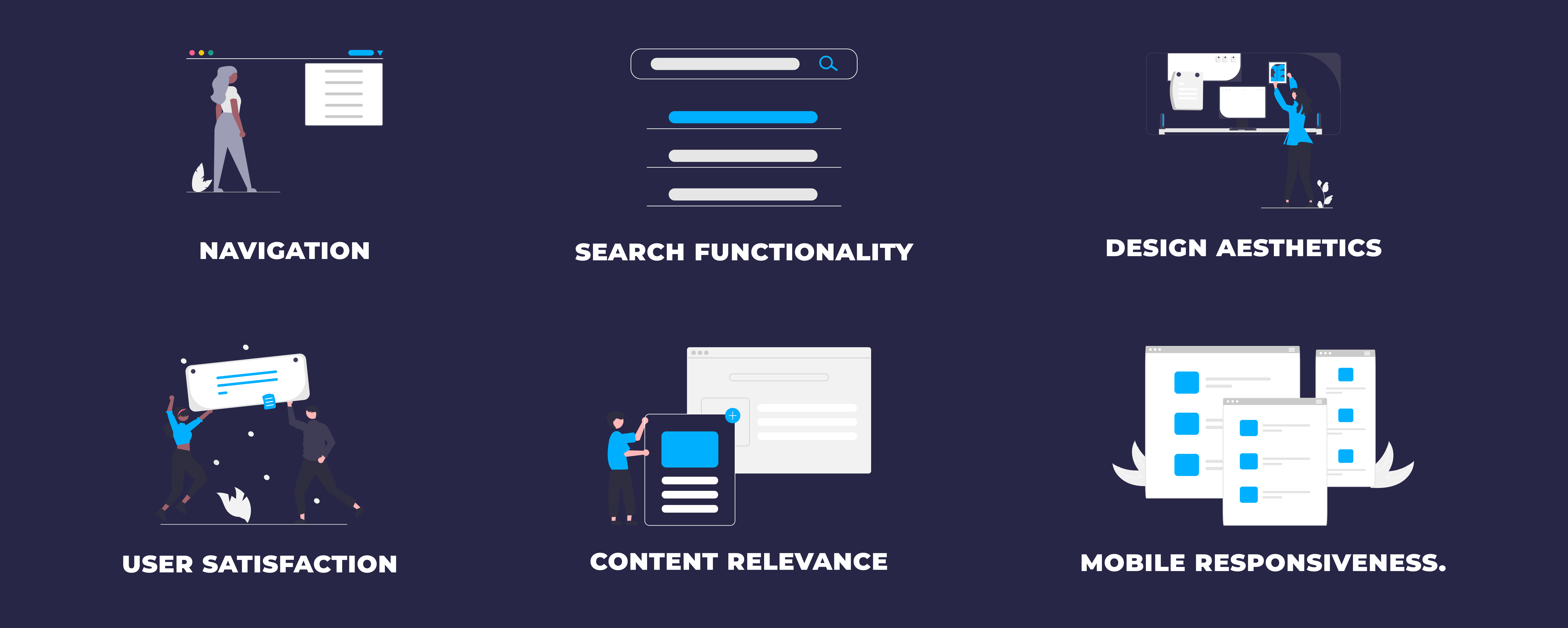
Navigation.
- Glints: The navigation on Glints is user-friendly, with clear access to job listings. Improving search filtering options could further enhance user experience.
- Ruang Guru: Ruang Guru's navigation is well-organized, with easy access to educational resources. Prominent access to saved study materials was suggested.
- Arka Learn: Arka Learn's navigation is well-structured & user-friendly, but users recommended making the search functionality more prominent.
Search Functionality.
- Glints: The search function on Glints is efficient, with users finding relevant job postings quickly. Additional filters for job preferences could be considered.
- Ruang Guru: Ruang Guru's search feature is robust, providing highly relevant results. An improved search algorithm for study materials was suggested.
- Arka Learn: Arka Learn's search functionality is reliable, but additional filters for price and course duration were suggested.
Content Relevance.
- Glints: Glints offers up-to-date and relevant job listings, though some users suggested improving the completeness of job descriptions.
- Ruang Guru: Ruang Guru's educational resources are diverse and relevant, but users requested more advanced study materials.
- Arka Learn: Arka Learn excels in content relevance, but users requested more courses on emerging technologies.
Design Aesthetics.
- Glints: Glints' design is visually appealing, though some users mentioned minor design inconsistencies on certain pages.
- Ruang Guru: Ruang Guru follows a clean and professional design approach, with a visually pleasing interface.
- Arka Learn: Arka Learn's design is elegant, playful and intuitive, with consistent design elements that users appreciated.
Mobile Responsiveness.
- Glints: Glints is fully responsive on mobile devices, providing a seamless experience for users.
- Ruang Guru: Ruang Guru's mobile version works smoothly, allowing users to access study materials conveniently on smartphones and tablets.
- Arka Learn: Arka Learn maintains its high-quality user experience on mobile devices, adapting well to different screen sizes.
User Satisfaction.
- Glints: Overall, users expressed high satisfaction with Glints, praising its job listings and user-friendly interface. Some users requested a more streamlined application process.
- Ruang Guru: User satisfaction with Ruang Guru was generally positive, particularly regarding the educational resources and ease of navigation. Some users suggested more interactive study materials.
- Arka Learn: Arka Learn received high marks for user satisfaction, with users praising its diverse course selection and interactive learning materials.
06
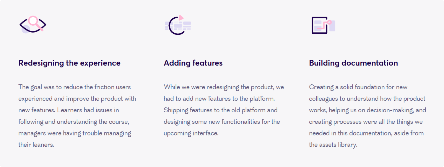
Redesigning the product.
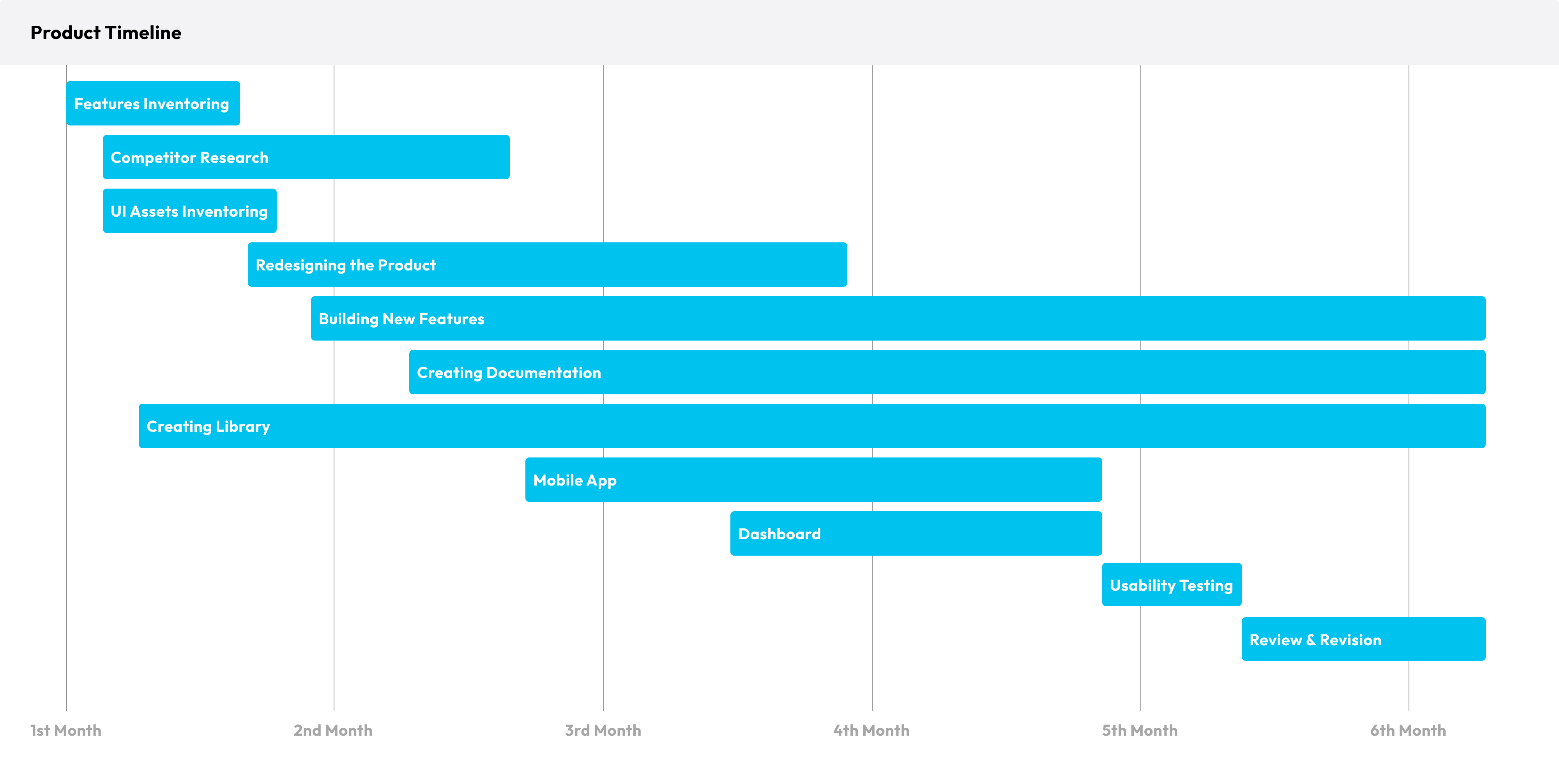
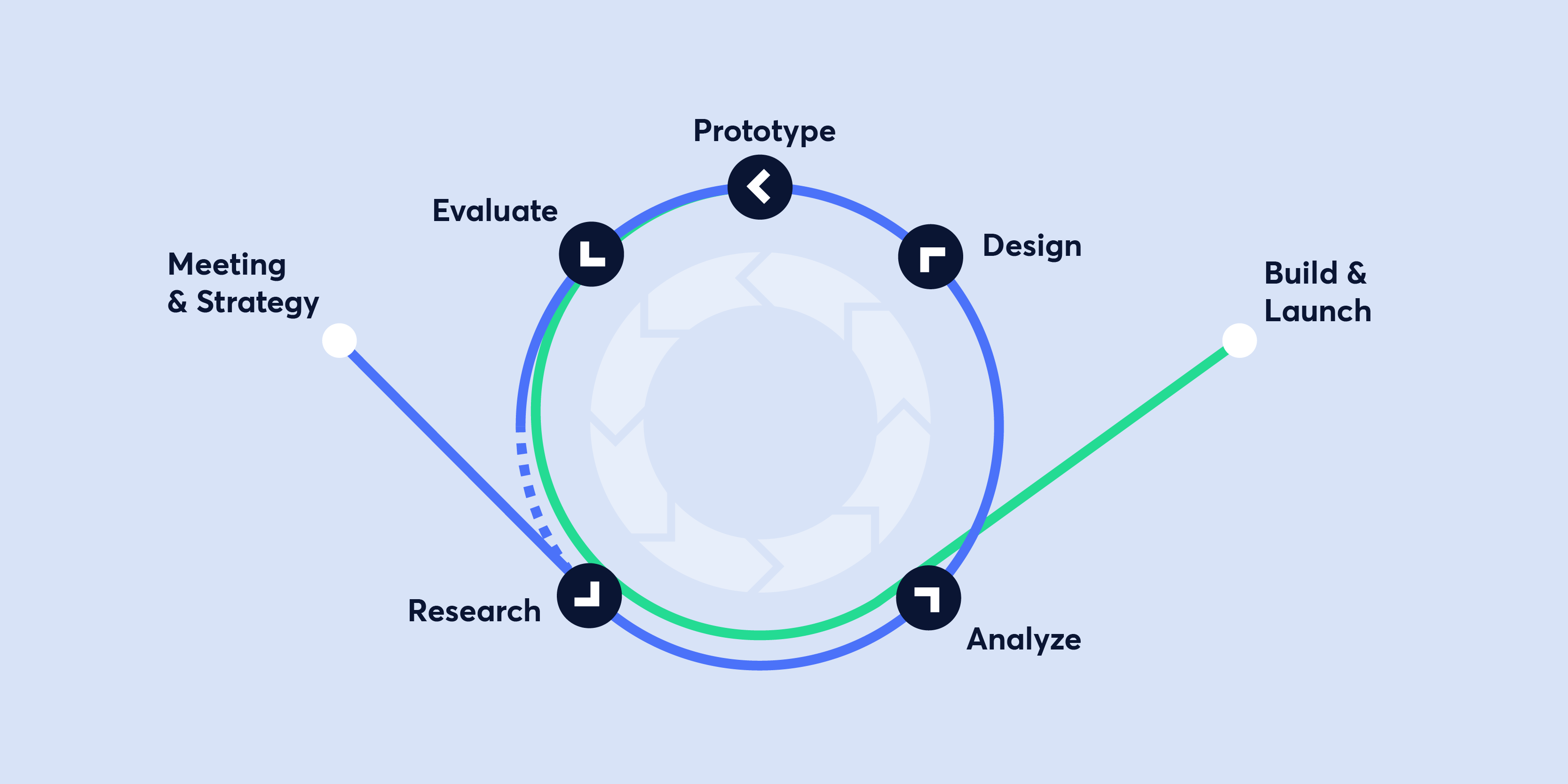
Timeline.
Since they already had a product redesign a year before, I took some time on the best approach to rebuild this product. I started by inventorying features, interface elements and interaction. I built a sitemap and created UX documents such as user stories to ease the communication between marketer, management and developers.
Product Sitemap & Building User Stories.
Working on a product sitemap allowed me to understand the goal of every page, which actions were linked and the most common way to perform an action. And of course building user stories helps a lot during the whole process of creating new features, it also helps to communicate with other members of the team and the client.
.png)
Wireframes.
With a focus on user experience, I design intuitive and visually appealing interfaces that effectively communicate the website's structure and functionality. My wireframes ensure a seamless user experience and are optimized for usability across different devices and browsers.
.png)
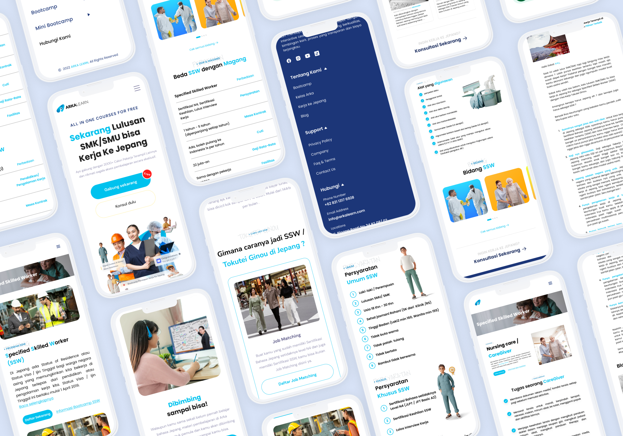
Design.
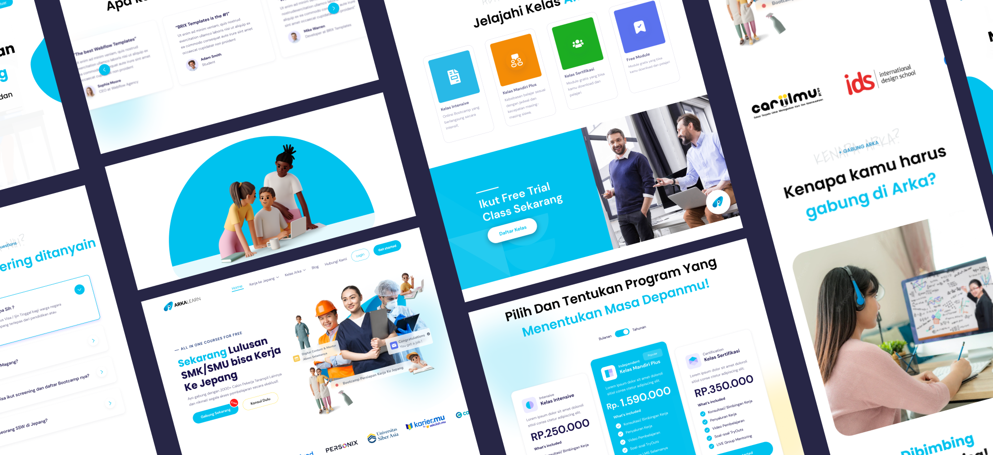
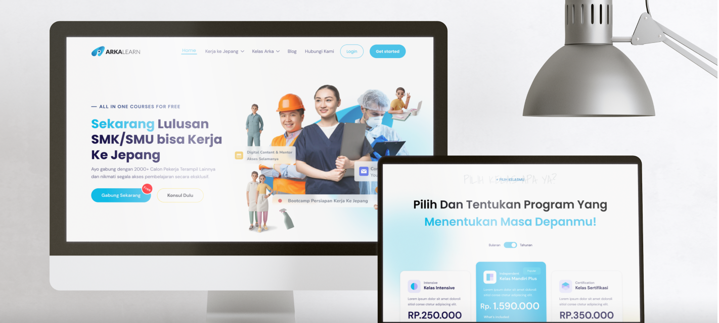
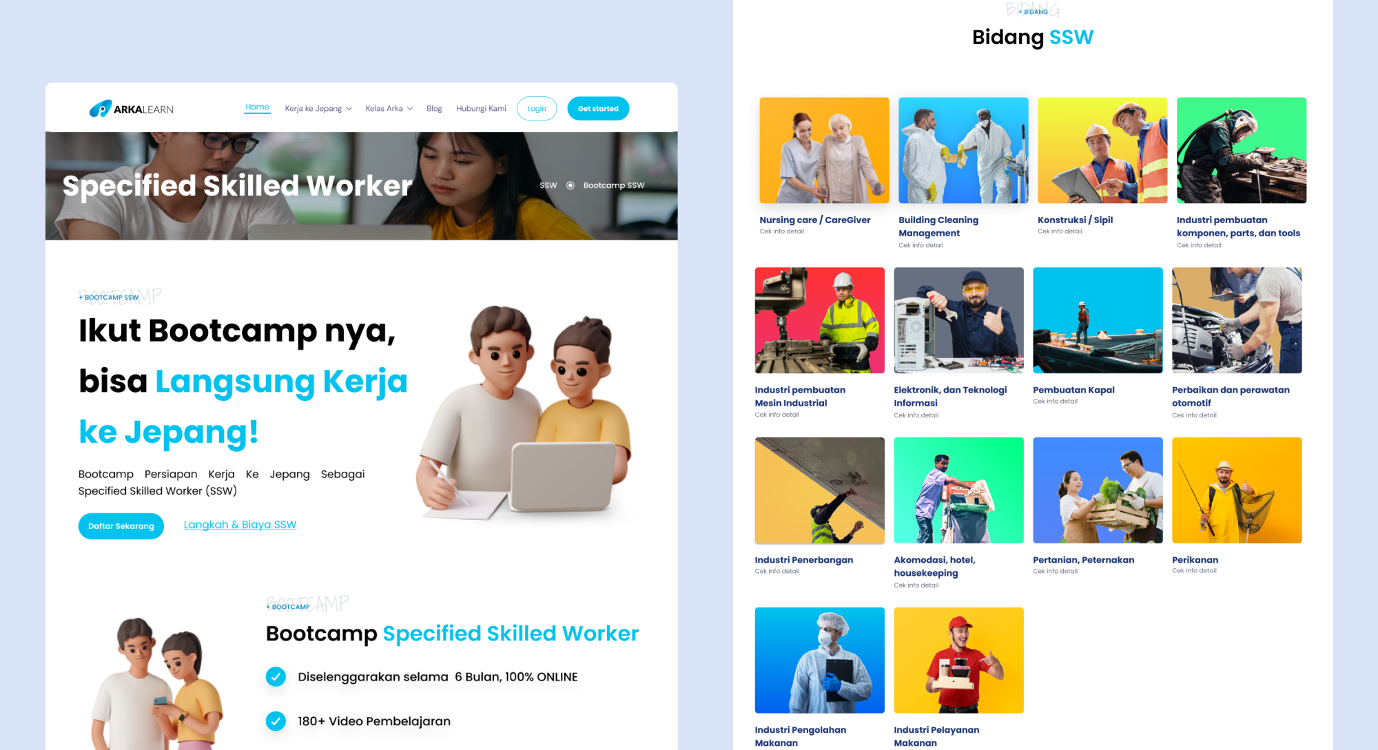
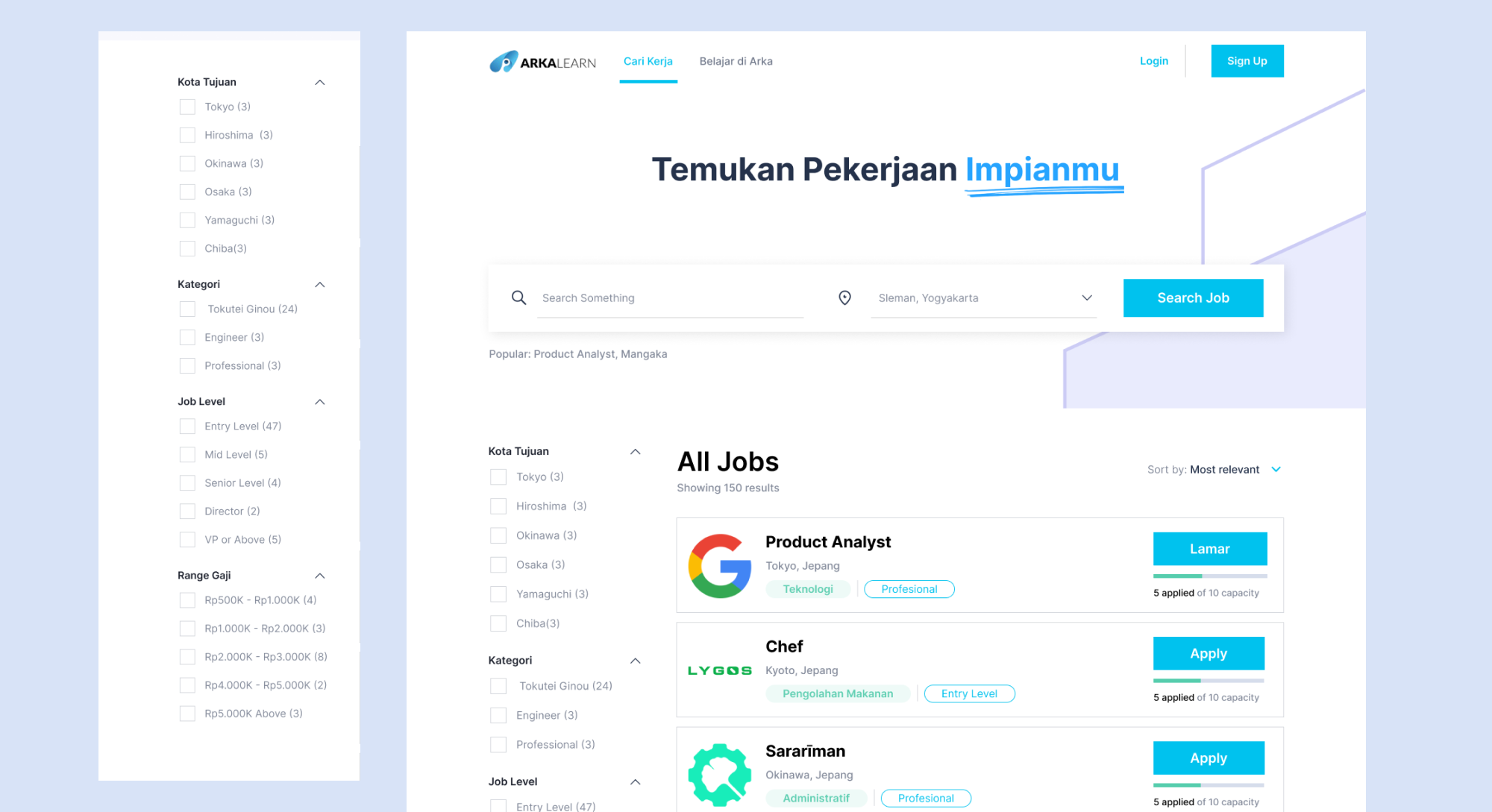
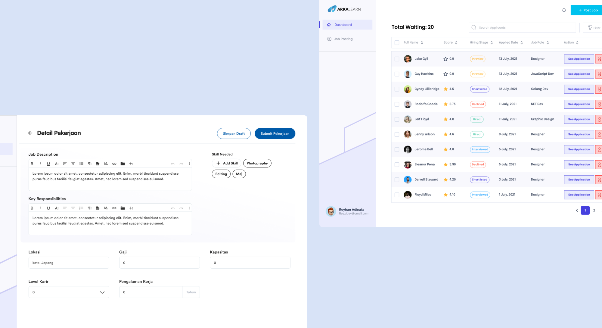
There were two main interfaces for the product, landing page and job portal. Landing page is a collection of information designed to capture the attention and interest of potential new customers. Job portal serves as a platform for you to find both candidates for job positions and employment opportunities. One of the challenges in defining and designing a job portal is meeting the detailed requirements of Japanese companies, particularly regarding documentation aspects.
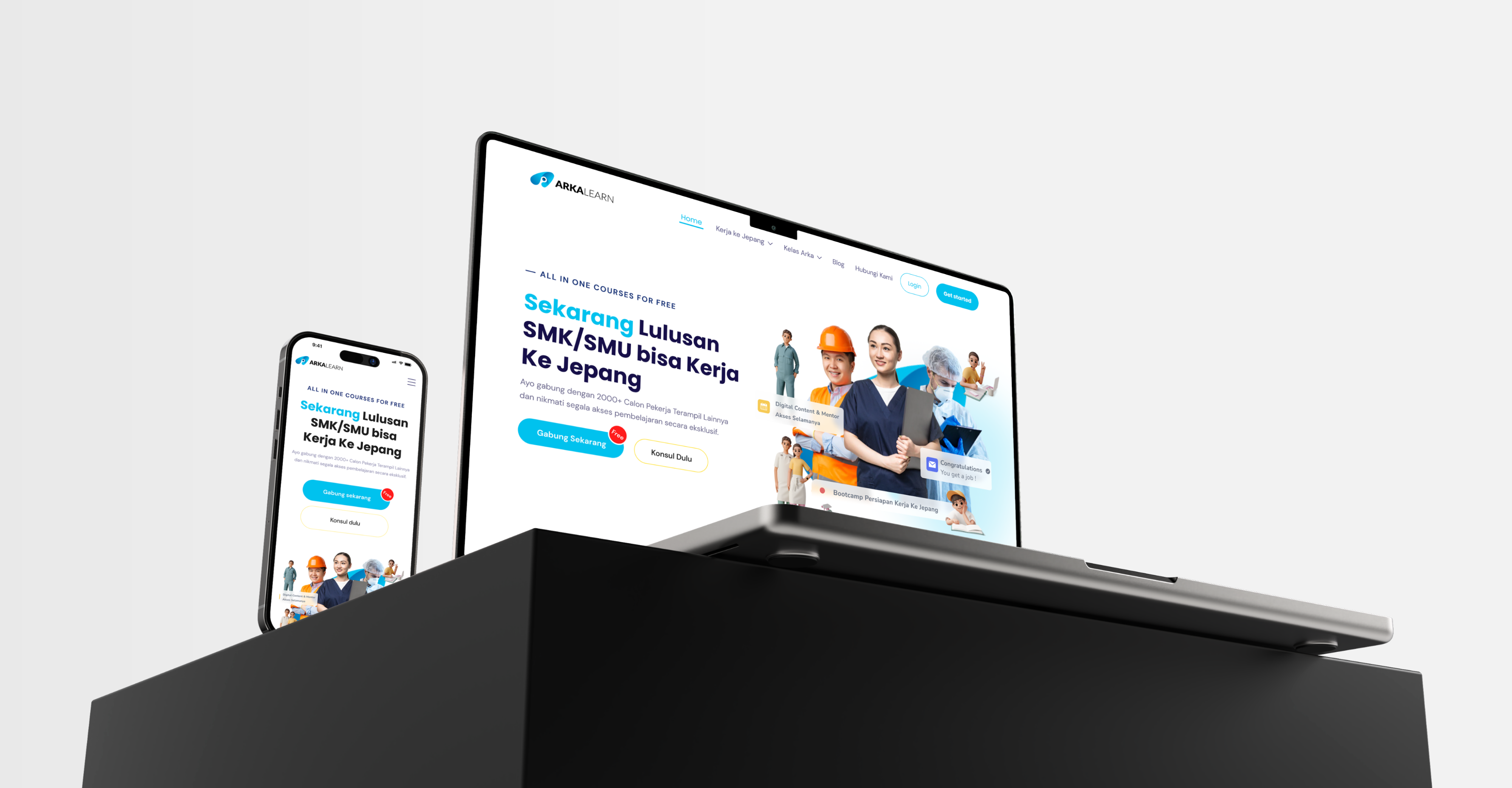
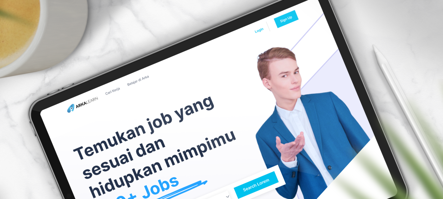
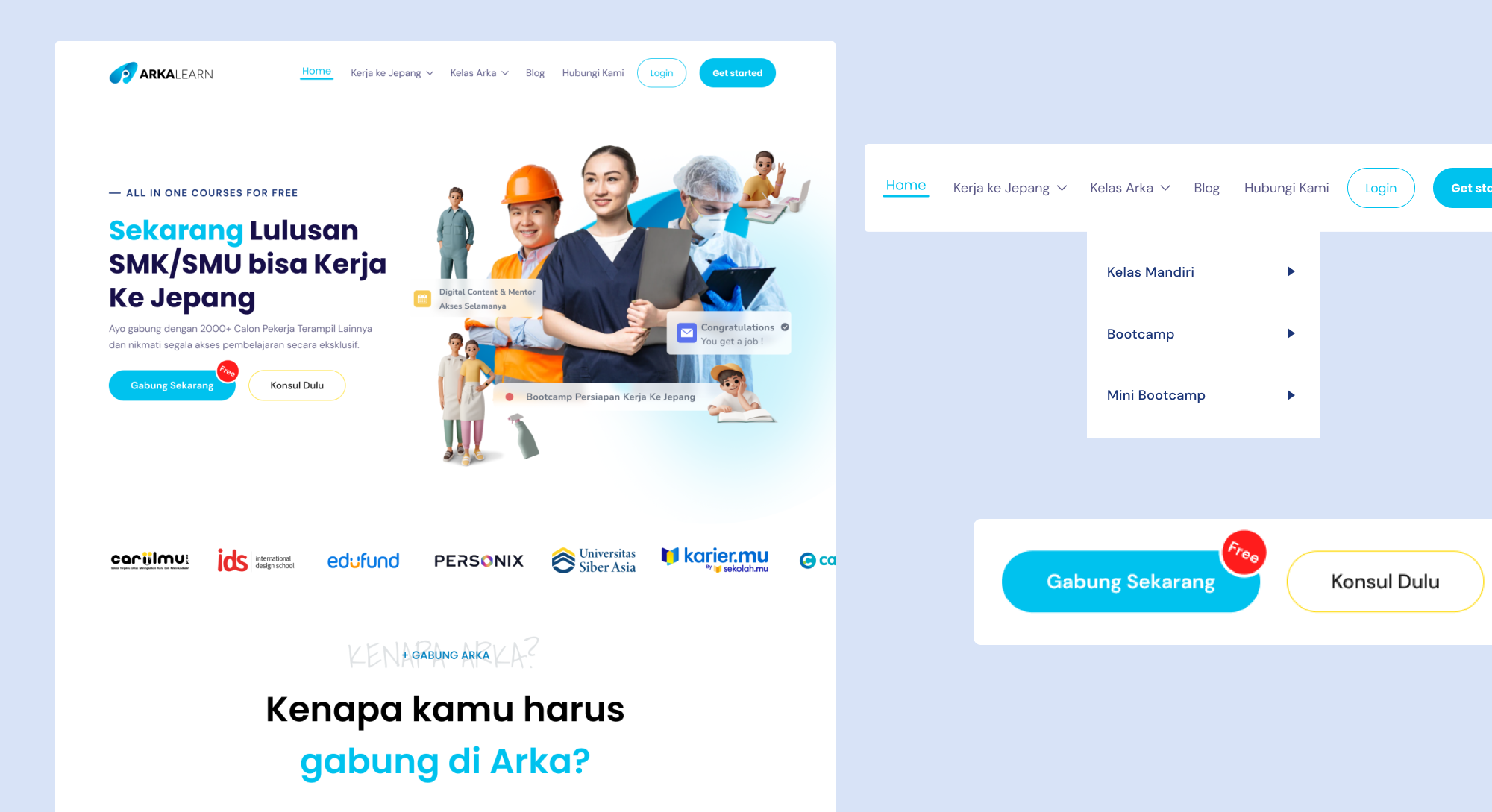
Homepage
Spesified Skilled Worker
Job Portal
Job Portal Dashboard
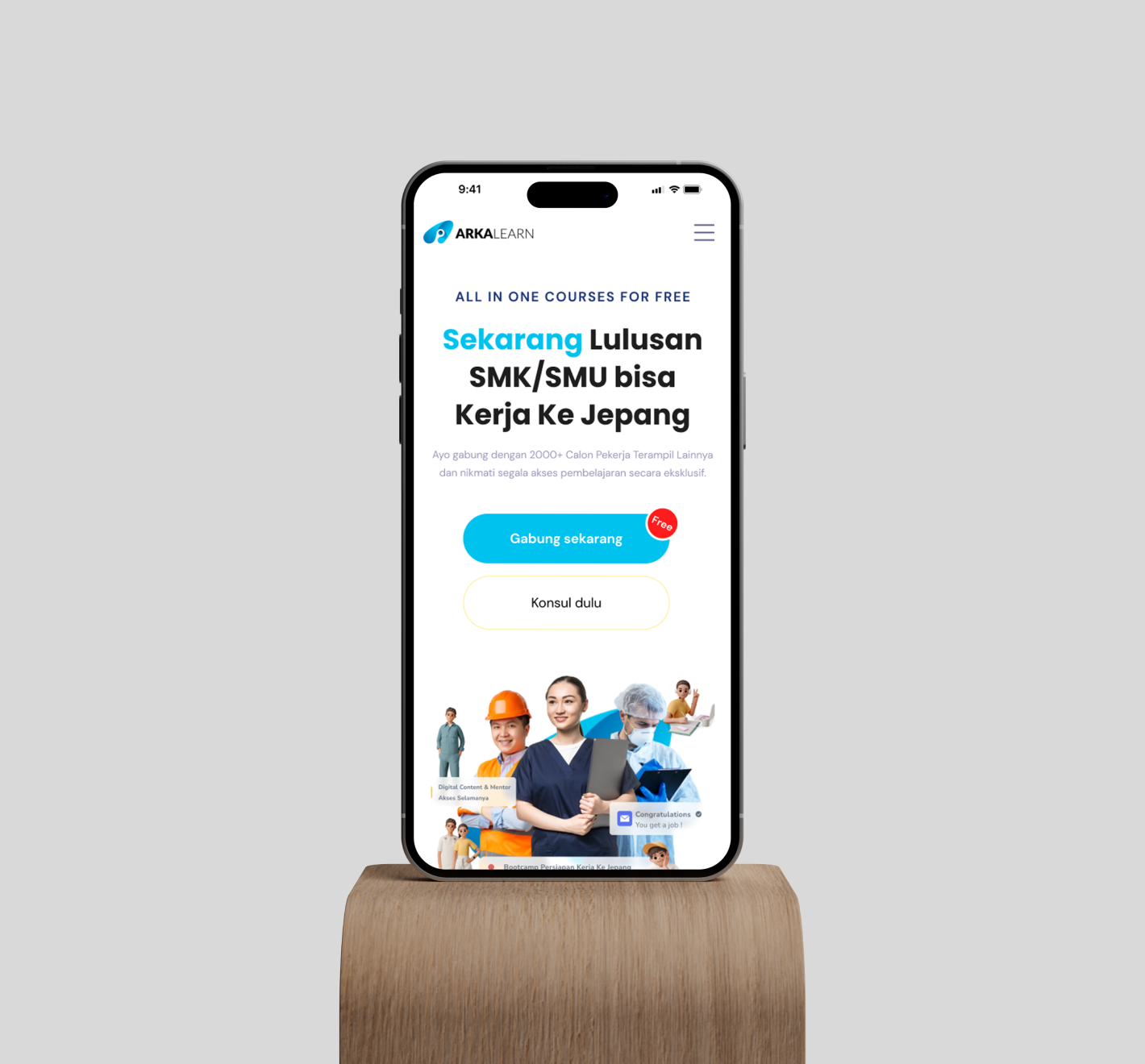
Mobile.
We extended the platform to a mobile application. Learners needed to have access to their course while being on-site, or so they could pursue their learning while travelling for work. On the mobile app, you were only able to follow a course.
07
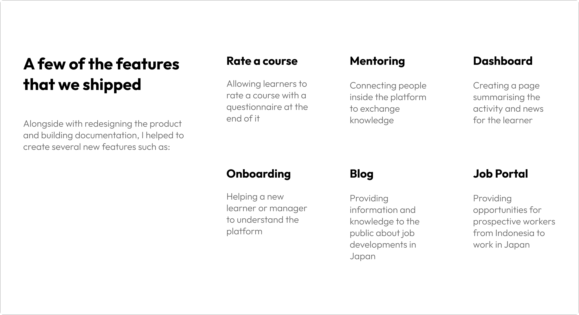
Adding features.
Since they already had a product redesign a year before, I took some time on the best approach to rebuild this product. I started by inventorying features, interface elements and interaction. I built a sitemap and created UX documents such as user stories to ease the communication between marketer, management and developers.
08
Design System.
After some time working on the product, I decided as part of the mission to build the documentation and design system. It would help me to communicate, ease the process of producing features and uniformise all the assets in the product. We mostly needed a place where we could put all the knowledge and thinking when we were working on new features.
.png)
.png)
.png)
.png)
09
Reflections.
During the project to revamp the Arka Learn website as a UI/UX designer, I had the opportunity to apply my skills and knowledge to improve the platform's overall user experience and visual appeal. As I reflect on this experience, several key takeaways come to mind.
- User-Centric Design Approach: One of the most crucial aspects of this project was adopting a user-centric design approach. Through user research, feedback analysis, and usability testing, I gained valuable insights into the target audience's preferences and pain points. This helped me make informed design decisions and tailor the website to meet the users' needs effectively.
- Collaboration and Communication: Collaboration with stakeholders, including developers and the Arka Learn team, played a vital role in the project's success. Clear and consistent communication was essential to align everyone's expectations and ensure a smooth workflow. By fostering an environment of open communication, I was able to incorporate feedback, address concerns, and maintain design integrity throughout the project.
- Iterative Design Process: The iterative design process was instrumental in refining the website's UI/UX. By creating wireframes, prototypes, and conducting usability testing, I received valuable feedback from users, allowing me to identify areas for improvement and make iterative design iterations. This approach helped to continually enhance the user experience, resulting in a more intuitive and engaging platform.
- Balancing Creativity and Branding: Finding the right balance between creativity and maintaining Arka Learn's branding was a challenge. While pushing the boundaries of design to create a visually appealing website, I had to ensure that the design elements aligned with the brand's identity. By using consistent typography, color schemes, and visual elements, I achieved a cohesive design that represented Arka Learn while infusing creativity and innovation.
- Responsive Design Considerations: With the increasing use of mobile devices, implementing responsive design was critical. Adapting the website to different screen sizes and ensuring an optimal user experience across various devices required careful planning and testing. I incorporated responsive design techniques, such as flexible grids and media queries, to create a seamless experience for users, regardless of the device they were using.
- Continuous Learning and Growth: Throughout the project, I encountered various challenges that pushed me to expand my knowledge and skills as a UI/UX designer. From staying updated on the latest design trends to learning about usability testing methodologies, I constantly sought opportunities to learn and grow. This project served as a valuable learning experience, allowing me to refine my skills and gain insights into the dynamic field of UI/UX design.
- Collaboration with Development Team: Collaboration with the development team played a significant role in bringing the design to life. Effective communication and collaboration ensured that the UI/UX design was accurately implemented, and the final product aligned with the original vision. By providing guidance and support during the development process, I was able to maintain design integrity and ensure a seamless user experience.
In conclusion, the revamp of the Arka Learn website as a UI/UX designer was an enriching and rewarding experience. By adopting a user-centric approach, collaborating effectively, following an iterative design process, and considering responsive design, I was able to create a visually appealing and user-friendly platform. This project has further fueled my passion for UI/UX design and reinforced the importance of continuously learning and adapting to create exceptional user experiences.